Doubling up
This past weekend was the big crop weekend at Cocoa Daisy, which is held twice a year (April and November) — and man, was it ever intense, and FUN. So much fun, in fact, that I didn’t end up taking a break from the festivities (and crafting!) on Friday, which was my original plan since I didn’t have anything really “fresh” to share earlier in the day. So, although I did post on Monday about Nat Kalbach’s ornament swap, I will consider this post to be two weeks worth of sharing. ![]() I’m hoping I will still be able to finish up one or two more projects based on the crop challenges, so you might even see a bonus post from me.
I’m hoping I will still be able to finish up one or two more projects based on the crop challenges, so you might even see a bonus post from me.
Maybe I’ll start, though, by sharing what’s freshest on my mind, and that’s that I’ve decided to try out Project Life for 2012. In 2009, I bought one of the original Project 365 (an earlier “incarnation” of the same product line by Becky Higgins) kits to do for 2010 — thinking that I would do it as a “photo a day” to have a record of my last months of pregnancy and most of Sara’s first year. I bought it “second hand” but unused, so it was already pre-assembled, and I actually did quite well with the “photo a day” part. I also journaled in bits and pieces, mostly in the “what does your day look like” thread on Willow Traders, but I never did get ANY of the journaling cards written because I let myself think I had to record every key detail on those cards or nothing at all. I also tried to “batch process” weeks worth of photos at one time, and it just didn’t work. There’s a part of me that still hopes I’ll be able to finish that album (it has photos printed for January through May, and all the memorabilia, notes, etc. are in a box in my closet), but sadly, I doubt it.
So, I know going into 2012 that I have to adopt a different strategy or it won’t work. There have been refinements to the product line — starting with the name change — to shift away from the calendar year specific/daily entries approach, and this coming year there are more page protector styles to allow for vertical photos, bigger memorabilia, etc., as well as new colour schemes. So, I liked that idea — and I also really liked what I’ve started seeing on various people’s blogs, which includes being more flexible/”forgiving” of yourself if you miss a day here and there, and including more of the “stuff” of life, little snippets of conversation, kids’ art, etc. — and even getting your family involved.
What sealed the deal for me, I think, was seeing how you can approach a week of your life (or even a month, if you prefer) as a single spread, in this very simple, slide-it-into-the-pockets-and-you’re-done album, and if you miss a day — so what, you’ve got a concise, beautifully presented portrait of this period of time. And then, if some weeks you want to take a more artsy approach to the spread, adding your own embellishments/doodads or patterned paper or inking or whatever techniques appeal to you, that’s great too — and you can add in extra pocket pages, or long journaling blocks, or an envelope of memorabilia.
I’ve enjoyed seeing Ali Edwards’ Project Life pages all year, and over the last couple of weeks I’ve been reading a number of other blogs and especially appreciated the detailed, “this is how I make it work” posts from people like Lisa Truesdell and Marcy Penner (fellow Canadian, and I’m guessing fellow Mennonite too). I’m totally cribbing Marcy’s “Project Life station”, using the baker’s rack I bought and put in our kitchen/dining area a few months ago. It’s become an overflow area for household papers, but I’m going to reclaim it for this project.
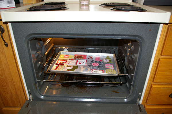
I justified the purchase of the materials as most of my Christmas gift from Bryan’s parents (who have us buy our own gifts with money they give us in advance), so I’m a bit disappointed that because of a “hiccup” (what does that mean, exactly?!), the Canadian distributor isn’t able to send out orders with the newest Project Life designs (Clementine and Cobalt) until mid-December — which means it won’t be here in time for the Orthners’ get-together on Dec. 10, and (with the Christmas shipping craziness) likely not even before we leave Dec. 22 for our time with my parents in Regina. But I’m still excited, and once I get a few (!) other things cleared off my house/craft project list, I will start setting up my Project Life station. ![]() Wheeeee!! I’m also planning another year-long project (One Little Word) for 2012, but I’ll talk about that some other time.
Wheeeee!! I’m also planning another year-long project (One Little Word) for 2012, but I’ll talk about that some other time.
So… back to the Cocoa Daisy crop, and some project sharing! Perhaps I should adopt a philosophy of “what happens at the crop, stays at the crop” ![]() but it’s all out there on a message board anyhow — so I will say that there was a lot of silliness and sharing of “cringe-worthy” experiences (mine involved a spruce beetle and a roomful of high-ranking politicians) and hot celebrity photos, a madcap (or so I’m told!) game of bingo, frenzied one-hour challenges (I tried the first one — almost got done in time, but not quite), goofy crop nametags (I even posed wearing mine), and some EXCELLENT dialogues with some of the scrapbooking/mixed media industry’s top names — the one with Julie Fei-Fan Balzer was my favourite. (And I even found out the back story on why she uses “milkcan” as her username — and it’s not just because that’s the name of the theatre company she founded.) There some great classes too, such as on stitching techniques and graffiti art, which I want to go back and read through, and try out the techniques.
but it’s all out there on a message board anyhow — so I will say that there was a lot of silliness and sharing of “cringe-worthy” experiences (mine involved a spruce beetle and a roomful of high-ranking politicians) and hot celebrity photos, a madcap (or so I’m told!) game of bingo, frenzied one-hour challenges (I tried the first one — almost got done in time, but not quite), goofy crop nametags (I even posed wearing mine), and some EXCELLENT dialogues with some of the scrapbooking/mixed media industry’s top names — the one with Julie Fei-Fan Balzer was my favourite. (And I even found out the back story on why she uses “milkcan” as her username — and it’s not just because that’s the name of the theatre company she founded.) There some great classes too, such as on stitching techniques and graffiti art, which I want to go back and read through, and try out the techniques.
The theme of the whole weekend was “Craft Fair”, and there were 20 different challenges from the Cocoa Daisy design team and guests (including Julie Balzer, Amy Tan (aka “Amy Tangerine”), Vicki Boutin and Ali Edwards), all using that theme as their jumping off point — like for example with “Jams and Jellies”, the challenge was to use one of the “fruit/veggie inspired” colour schemes for your layout. The challenges are still open, actually, until this Sunday night — so if you want to enter one or more of them, head over to Cocoa Daisy. ![]()
I completed five of the numbered challenges, which for me is amazing — Bryan was so sweet, and gave me Friday and Saturday (and part of Sunday, although we also attended church and had a great lunch, I made cupcakes since it’s was Bryan’s 41st birthday, and then had his brother and sister-in-law over for supper, cupcakes and a game of “Bonkers”) to just focus on my crafting. On Wednesday night, I stayed up WAY too late working on another of the challenges, and maybe I’ll get that done and shared later this weekend.
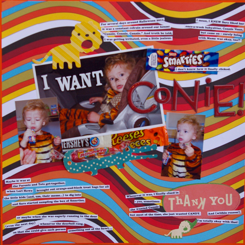
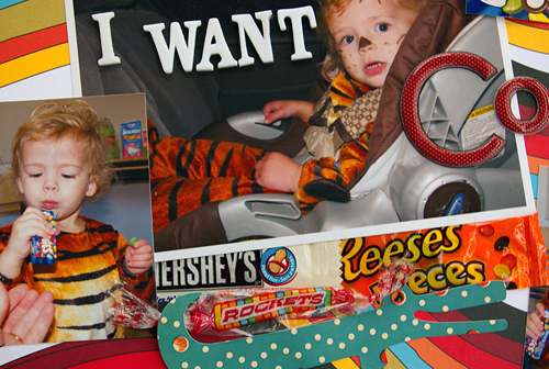
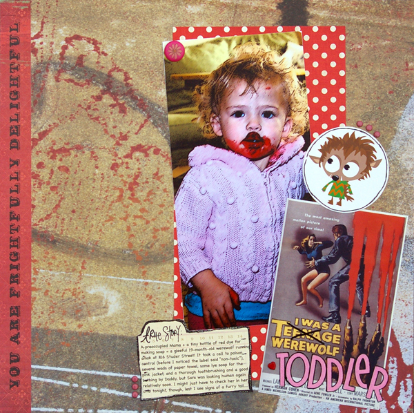
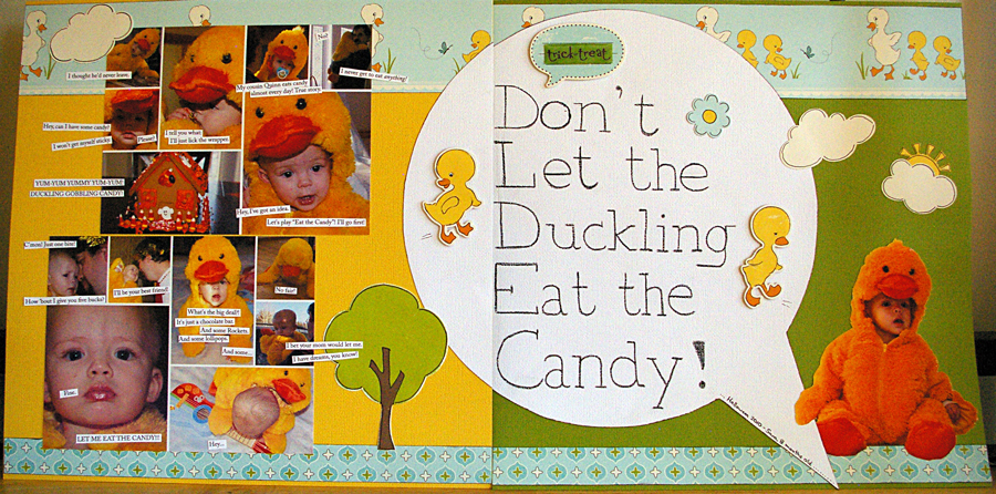
The first of the challenges I finished was a layout based on a sketch by Vicki Boutin, and I documented Sara’s 2nd Halloween. I even recycled the wrappers from my crop snacks — leftover Halloween candy. ![]() The journaling reads: “For several days around Halloween 2011, it was a constant refrain around our house: ‘Connie. Connie. Connie.’ And truth be told, I was getting irritated, even a little jealous. I mean, I KNEW Sara liked her once-a-week babysitter, Connie Venn, but come on – surely being with Mama was okay, too?! I don’t know how it finally clicked. Maybe it was at the Parents and Tots get-together, when Lori Howe brought out orange-and-black treat bags for all the little kids (and, um, their moms…) to dig into and Sara started sampling the box of Smarties, or maybe when she was eagerly running to the door (even the next day) whenever the doorbell rang, so that she could give each person something out of the bowl…. Whenever it was, I finally clued in – yes, sometimes she wanted Connie, but most of the time, she just wanted CANDY. And (within reason!) I’m totally okay with that!”
The journaling reads: “For several days around Halloween 2011, it was a constant refrain around our house: ‘Connie. Connie. Connie.’ And truth be told, I was getting irritated, even a little jealous. I mean, I KNEW Sara liked her once-a-week babysitter, Connie Venn, but come on – surely being with Mama was okay, too?! I don’t know how it finally clicked. Maybe it was at the Parents and Tots get-together, when Lori Howe brought out orange-and-black treat bags for all the little kids (and, um, their moms…) to dig into and Sara started sampling the box of Smarties, or maybe when she was eagerly running to the door (even the next day) whenever the doorbell rang, so that she could give each person something out of the bowl…. Whenever it was, I finally clued in – yes, sometimes she wanted Connie, but most of the time, she just wanted CANDY. And (within reason!) I’m totally okay with that!”
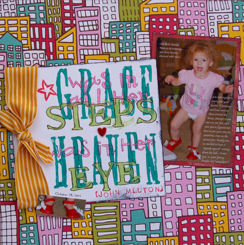
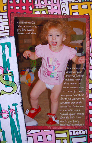
I also tried out Ali Edwards’ challenge to “go big with your text”, for which I decided to haul out my acrylic paint, my ancient (and mostly unused) foam letter stamps and some smaller acrylic stamps, and try making some word art out of a quote from John Milton: “Grace was in all her steps, and heaven in her eye” (got an extra “was” in there by accident). I had been wanting to do a layout about Sara’s fascination with her shoes — especially these red ones that squeak when she walks — and this seemed like a good opportunity.
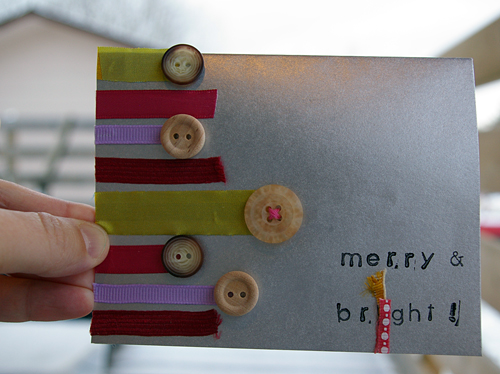
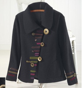
I tackled the “clothing” challenge next, which involved taking inspiration from one of the posted items of clothing, and using it to create a Christmas card. I used a picture of a long grey coat with wooden buttons and strips of coloured fabric to create this card. The candle in the “Merry and Bright” title was an attempt to cover up some problematic stamping (the “i” bent and smeared ink on my project), but I thought it worked out reasonably well. Here is the inspiration piece:
As you can perhaps see in the background of that shot of my Christmas card, it has been snowing here, which made photographing these two remaining projects a challenge. The text on the black-and-white layout got smeared a bit by falling snow when I tried to photograph it on our deck, and the other layout was photographed on my crafting desk, and the lighting in my office is not the best for photographing. But that’s what I’ve got right now….
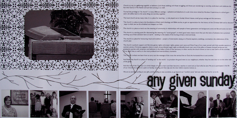
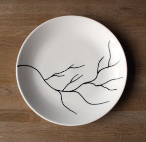
Anyhow, the black-and-white layout — which combines some of my reflections on what the word “church” means to me, and photos taken (for the most part) at our friends John and Timea Patterson’s induction as our pastor couple — was done in response to a challenge to use a photo of a black-and-white ceramic piece as our inspiration, using no other colours. Here is the piece that I used:
I took my title from a song by Carolyn Arends (here are the lyrics).
Journaling: “Church, to me, is a gathering together as believers (and those seeking, and those struggling, and those just wondering) to worship, work, learn and celebrate the fact that God is in His heaven and yet here among us as well. I’ve had the privilege to “do church” in many different settings – cathedral and lakeshore, in a salt mine once visited by Nicolaus Copernicus, in a school gym – and it all comes back to the same thing: we worship together.
The local church serves many roles. It is a place for teaching – a role played out in Sunday School classes, small group settings and the sanctuary. The church is a place to learn the foundations of faith, both theology and Bible stories, to gain an appreciation for the history of the Christian faith and to discover ways in which we can be stretched and deepen our faith.
The church is a place to work out the meaning of community, in relationships with people of every generation and background, some we like and some we don’t. The church is a starting point for discovering the meaning of a “social gospel”, in which good news means more than just the news of salvation, but a practical working out of that salvation here on earth – tending to the needs of the hurting of heart, mind and body.
The church is a place for honouring ritual and tradition – prayers of intercession, laying on of hands, baptisms, weddings, communion, the celebrations of the church year. The church is potluck suppers and libraries, games nights and prayer nights, potato sack races and Dixie Cups of ice cream served with little wooden spoons at summer picnics, Christmas pageants where a small, uncoordinated angel might accidentally knock over one of the pillars of heaven, farewell barbecues and graduation parties with streamers and balloons in the lobby in front of the sanctuary: in other words, the church shows us how to see God in all the activities of our daily lives, as well as in the most profound and extraordinary moments. The church is where we learn how to carry out the message of the cross: the vertical line to God, the horizontal line to one another.
And finally, the church is a place of “sending out” to the world – to proclaim the good news to our neighbours, whether they live next door or on the other side of the globe. And the role of the Christian is to drink deeply of it all, to learn and then become a teacher, to send and, as God wills, be sent. We are to participate in the life of our church, not just sit in a pew on Sunday morning and then slip out the door before anyone notices us. We are to serve according to our gifts, and be willing to test ourselves, to go beyond our “comfort zone” and see what God has for us to do.”
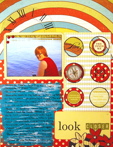
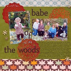
And then finally, I did a layout about me. This started out as my incomplete one-hour challenge layout, but it fit so neatly into the “home baked” challenge that all I had to add was some sparkly items (the white and red pearls), write the journaling and call it done. (The other requirements were something white, something red, something with dimension/texture, and answers to some questions about ourselves.)
Okay, that’s it for now. I may try to get some better photos of those last two layouts if the weather is decent. If you’ve gotten this far, I thank you — I think this is the longest blog post I’ve ever written, so I hope it makes up for my absence last week. This coming week I plan to get back to my December Daily preparations, and get to work on my ornament for the swap — I can’t believe December is nearly here already!! Thank goodness my Christmas shopping is 90 per cent done…. I’m hoping to find one or two more gifts at the local craft fair this weekend.
Cheers! (Oh, and happy Thanksgiving this coming week to my American friends.)
